To design a website that everyone would enjoy using, there are certain UX principles (or laws) you need to keep in mind.
These UX principles guide product design as they shed light on the psychology behind users’ expectations. Therefore, following them is a must for anyone aiming to create winning designs.
They are cause and effect relationships where one event (the cause) makes another event happen (the effect). Whether a designer acknowledges them or not, the laws rule and operate to affect the effectiveness of a website design project.
Fitts’s Law

“The time required to move an object to a target area is a function of the ratio between the distance to the target and the size of the target”.
Fitts’s law was conceived by an American psychologist, Paul Fitts in 1954. His law dictates that fast movements and small targets result in greater error rates, due to the speed-accuracy trade-off. This means that the smaller your target area is, the longer it takes the user to perform that action based on the distance/size ratio.
A classic example of this would be the clickable buttons on your responsive website.
When a user accesses your website via their mobile phone, it’s good practice, according to Fitts Law, to ensure that the buttons are a little bit bigger as the user will be predominantly using their fingers to click the buttons.
The key takeaways
- The target area should be large enough for users to both discern what it is and to accurately select them.
- Buttons should have sufficient spacing between each other.
- Placing similarly used functions or features together allows them to be easily acquired.
Hicks Law

“The more choices you give a user, the longer it takes for them to make a decision”
According to the Interaction Design Foundation's website, the “Hick’s Law" (or the Hick-Hyman Law) is named after a British and an American psychologist team of William Edmund Hick and Ray Hyman.
In 1952, this pair set out to examine the relationship between the number of stimuli present and an individual’s reaction time to any given stimulus. As you would expect, the more stimuli to choose from, the longer it takes the user to make a decision on which one to interact with. Users bombarded with choices have to take time to interpret and decide, giving them work they don’t want.
Choices are not necessarily a bad thing however giving a user too many options to choose from might overwhelm them and based on my experience, increases bounce rates too.
An example of this would be when businesses add a plethora of links to their navigation bar. This confuses the user about where to navigate to next. Fewer options are therefore presented which also assists to reduce memory load and categorise and group the information together. This will help the user to find exactly what they were looking for.
The key takeaways
- Avoid providing too many choices, it will increase the cognitive load for users.
- Break down the long or complex processes into screens with fewer options.
- Use progressive onboarding to minimise cognitive load for new users.
Jakob’s Law

“Users spend most of their time on other sites. This means they prefer your site to work the same way as all the other sites they already know."
Jakob's Law was created by Jakob Nielsen, a User Advocate and principal of the Nielsen Norman Group. The law states that users prefer your website to function similarly to the websites they visit on regular basis. That means that important elements on your website should behave as similar as possible to elements on other websites that the user visits regularly. It’s all about building rapport through familiarity.
An example of this would be your header navigation. Most websites you visit would have the company logo in the top left-hand corner. The logo would probably be clickable and linked to the homepage if a user should click it. This is something that they are familiar with so don’t try and reinvent the wheel.
The key takeaways
- Users expect that familiar products to another will appear similar.
- Good user experiences are made possible when the designer’s mental model is aligned with the user’s mental model.
- By leveraging existing mental models, we can create high-level user experiences in which the user can focus on their task rather than learning new models.
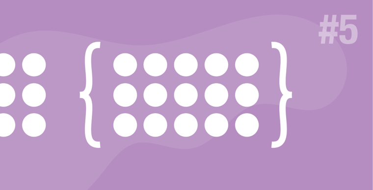
Law of Prägnanz

“People will perceive an interpret ambiguous or complex images as the simplest form possible, because it is the interpretation that requires the least cognitive effort of us"
The key takeaways
- The human eye likes to find simplicity and order in complex shapes because it prevents us from becoming overwhelmed with information.
- Research confirms that people are better able to visually process and remember simple figures than complex figures.
- The human eye simplifies complex shapes by transforming them into a single, unified shape.
Law of Proximity
"Objects that are near, or proximate to each other, tend to be grouped together."
The key takeaways
- Proximity helps to establish a relationship with nearby objects.
- Elements in close proximity are perceived to share similar functionality or traits.
- Proximity helps users understand and organise information faster and more efficiently.
Miller's Law
"The average person can only keep 7 (plus or minus 2) items in their working memory."
The key takeaways
- Don’t use the “magical number seven” to justify unnecessary design limitations.
- Organise content into smaller chunks to help users process, understand, and memorise easily.
- Remember that the short-term memory capacity will vary per individual.
Parkinson's Law

"Any task will inflate until all of the available time is spent".
The key takeaways
- Limit the time it takes to complete a task to what users expect it’ll take.
- Reducing the actual duration to complete a task from the expected duration will improve the overall user experience.
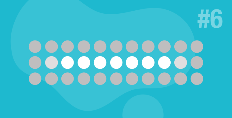
The Serial Position Effect
"Users have a propensity to best remember the first and last items in a series".
The serial position effect is a term coined by Herman Ebbinghaus. It suggests that among the list of elements in a series, we tend to remember best the first and the last items in that list or sequence. We recall them much better than the middle ones.
This is the reason we put the most important link items on a list first and last when we adhere to UX best practices.
The key takeaways
- Placing the least important items in the middle of lists can be helpful because these items tend to be stored less frequently in long-term and working memory.
- Positioning key actions on the far left and right within elements such as navigation can increase memorisation.
Tesler's Law

"Tesler's Law, also known as The Law of Conservation of Complexity, states that for any system there is a certain amount of complexity which cannot be reduced."
The key takeaways
- All processes have a core of complexity that cannot be designed away, and therefore must be assumed by either the system or the user.
- Ensure the burden of complexity is shared by identifying appropriate places to move inherent complexity.
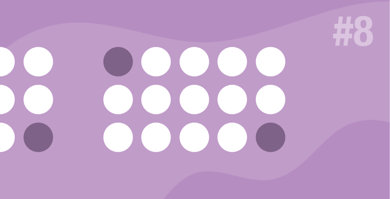
Von Restorff Effect
“Also known as The Isolation Effect, predicts that when multiple similar objects are present, the one that differs from the rest is most likely to be remembered.”
The theory was coined by German psychiatrist and paediatrician Hedwig von Restorff (1906–1962), who, in her 1933 study, found that when participants were presented with a list of categorically similar items with one distinctive, isolated item on the list, memory for the different item was improved.
A great example of this would be that little chat widget at the bottom right corner of your website. In many cases, it would be designed in a contrasting colour making it stand out from the rest of the website. While this can be irritating if the effect is too exaggerated, it draws the user's attention to that element.
The key takeaways
- Make important information or key actions visually distinctive.
- Use restraint when placing emphasis on visual elements to avoid them competing with one another and to ensure salient items don’t get mistakenly identified as ads.
- Don’t exclude those with a colour vision deficiency or low vision by relying exclusively on colour to communicate contrast.
- Carefully consider users with motion sensitivity when using motion to communicate contrast.
Zeigarnik Effect

“People remember uncompleted or interrupted tasks better than completed tasks".
The key takeaways
- Invite content discovery by providing clear signifiers of additional content.
- Provide a clear indication of progress in order to motivate users to complete tasks.
- Providing artificial progress towards a goal will help to ensure users are more likely to have the motivation to complete that task.
I can think of many examples of where this principle has been used, one of them is obvious on the Udemy website. You’ll notice that the best-selling courses are listed at the top of the website. This is also the reason why you would have your best-selling or most popular products listed first on your online store because users tend to click on that item first.
These are just a few of many UX laws that you can implement in your next website project. Remember, that your goal with any project would be to “not make the user think too hard” but rather allow them to flow freely through the website. Keeping these principles in mind will help you to create a better user experience for your users.
Credits: https://lawsofux.com/en/
