Over the last few years, our role as designers has evolved so much that we constantly need to be aware of many things. One of them is the user's behaviour on your product or website. Our main goal is to make sure the user has a seamless experience when they visit your website or interact with your product.
To design a website that everyone would enjoy using, there are certain UX Laws you need to keep in mind. Below you will find some of my favourite principles that you can apply to your next website design project.
Hicks Law
“The more choices you give a user, the longer it takes for them to make a decision”
According to the Interaction Design Foundation's website, the “Hick’s Law" (or the Hick-Hyman Law) is named after a British and an American psychologist team of William Edmund Hick and Ray Hyman.
In 1952, this pair set out to examine the relationship between the number of stimuli present and an individual’s reaction time to any given stimulus. As you would expect, the more stimuli to choose from, the longer it takes the user to make a decision on which one to interact with. Users bombarded with choices have to take time to interpret and decide, giving them work they don’t want.
Choices are not necessarily a bad thing however giving a user too many options to choose from might overwhelm them and based on my experience, increases bounce rates too.
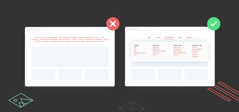
An example of this would be when businesses add a plethora of links to their navigation bar. This confuses the user about where to navigate to next. Fewer options are therefore presented which also assists to reduce memory load and categorise and group the information together. This will help the user to find exactly what they were looking for.
Fitts’s Law
“The time required to move an object to a target area is a function of the ratio between the distance to the target and the size of the target”.
Fitts’s law was conceived by an American psychologist, Paul Fitts in 1954. His law dictates that fast movements and small targets result in greater error rates, due to the speed-accuracy trade-off. This means that the smaller your target area is, the longer it takes the user to perform that action based on the distance/size ratio.
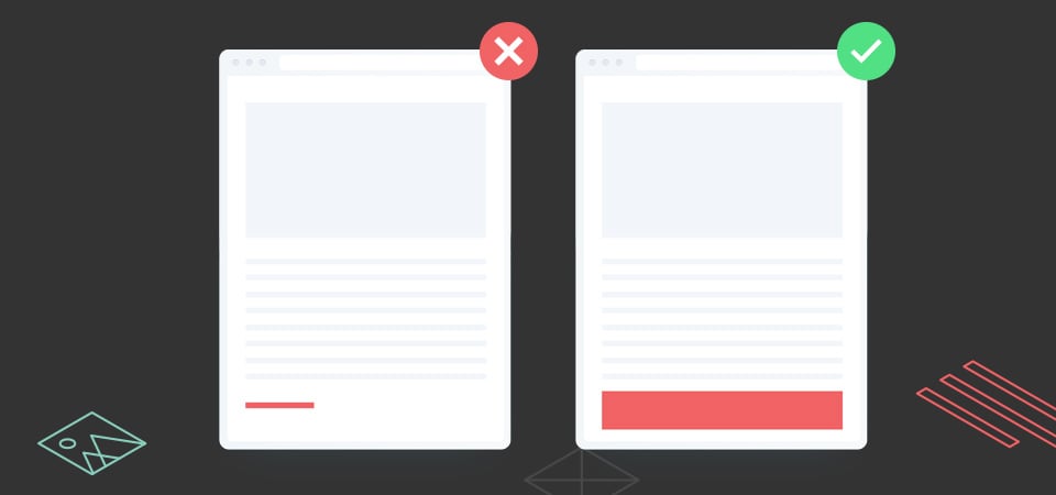
A classic example of this would be the clickable buttons on your responsive website.
When a user accesses your website via their mobile phone, it’s good practice, according to Fitts Law, to ensure that the buttons are a little bit bigger as the user will be predominantly using their fingers to click the buttons.
Jacob’s Law
“Users spend most of their time on other sites. This means they prefer your site to work the same way as all the other sites they already know."
Jacob's Law was created by Jakob Nielsen, a User Advocate and principal of the Nielsen Norman Group. The law states that users prefer your website to function similarly to the websites they visit on regular basis. That means that important elements on your website should behave as similar as possible to elements on other websites that the user visits regularly. It’s all about building rapport through familiarity.
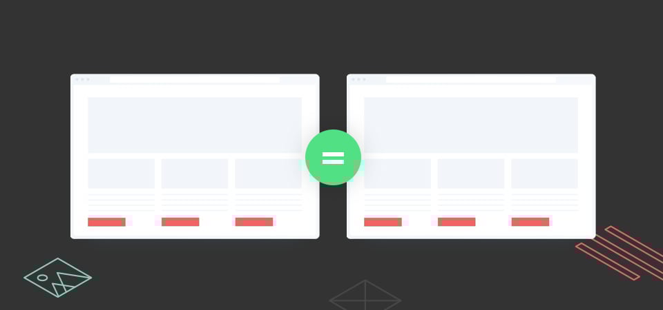
An example of this would be your header navigation. Most websites you visit would have the company logo in the top left-hand corner. The logo would probably be clickable and linked to the homepage if a user should click it. This is something that they are familiar with so don’t try and reinvent the wheel.
Von Restorff Effect

“Also known as The Isolation Effect, predicts that when multiple similar objects are present, the one that differs from the rest is most likely to be remembered.”
The theory was coined by German psychiatrist and paediatrician Hedwig von Restorff (1906–1962), who, in her 1933 study, found that when participants were presented with a list of categorically similar items with one distinctive, isolated item on the list, memory for the different item was improved.
A great example of this would be that little chat widget at the bottom right corner of your website. In many cases, it would be designed in a contrasting colour making it stand out from the rest of the website. While this can be irritating if the effect is too exaggerated, it draws the user's attention to that element.
Serial Position Effect
“Users have a propensity to remember the first and last item in a series.”
The serial position effect is a term coined by Herman Ebbinghaus. It suggests that among the list of elements in a series, we tend to remember best the first and the last items in that list or sequence. We recall them much better than the middle ones.
This is the reason we put the most important link items on a list first and last when we adhere to UX best practices.
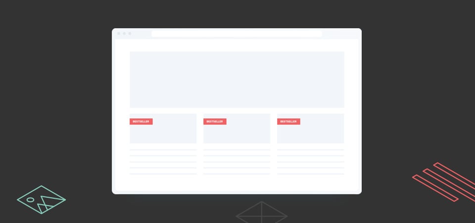
I can think of many examples of where this principle has been used, one of them is obvious on the Udemy website. You’ll notice that the best-selling courses are listed at the top of the website. This is also the reason why you would have your best-selling or most popular products listed first on your online store because users tend to click on that item first.
These are just a few of many UX laws that you can implement in your next website project. Remember, that your goal with any project would be to “not make the user think too hard” but rather allow them to flow freely through the website. Keeping these principles in mind will help you to create a better user experience for your users.
